12.12.2008

Type Book


1930 - the News Chronicle newspaper is formed by the merger of the Daily News and the Daily Chronicle
1960 News Chronicle merges with the Daily Mail

This is the News Chronicle specimen book as complied by the Advertising director: W.E. Tomlin. Tomlin regarded this book as different from the ordinary newspaper type-book because it contained full alphabets on paper which didn't affect the visual weight of the face.
12.09.2008

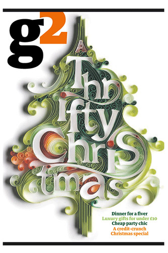
G2


The Guardian's G2 on Monday featured some beautiful paper typography throughout from illustrator Yulia Brodskaya, also shown are a couple of pieces from her website Yulia Brodskaya

12.04.2008

Studio Box


We here at Things To Look At recently received a link to the archive of Studio Box; the design studio in Milan founded in 1987 by Robin Derrick, Claudio Del Olio and Daniele Basilico. We of course couldn't help but be impressed, favorites include the work on Italian Elle, Ad campaigns for Gianfranco Ferrer, Dolce & Gabbana, as well as the work for Italian furniture giants like B&B Italia, and Capellini amongst others.


The archive marks an exciting chapter in the history of fashion and graphic design, bold and expressive use of typography and image making.
The studio still exists and continues its collaboration with fashion, retail and commercial clients, and long may it continue. Many thanks to Paul from The EDO for pointing this out to us.

11.26.2008

Alumni Magazine

Mag Culture reviewed the latest offering from Luke Hayman: The Harvard Alumni magazine. Since it never made it to press, the only way to see it is online here Jeremy didn't show much of the insides so here are a few really great spreads showing how impactful illustration really can be.


11.25.2008

Rolling Stone


Publication: Rolling Stone
Date: October 21st 1976
Issue Number: 224
Price: 50p
Typography: Elizabeth Paul

What makes two portraits work well side by side? Is it that they are totally different people? Is it that they look almost the same? Is it that one expression is shocked whilst one smiles? Or that one is wearing thick rimmed spectacles whilst another is merely holding some? Looking through this special bicentennial issue of Rolling Stone which showcased 76 Richard Avedon portraits, full size, with no text, it's plain to see that each image has been carefully chosen to sit next to its partner and it's great to think about why they work so successfully as a pair, regardless of the subjects being, at that time, the most powerful people in America.


11.18.2008

Show and Tell


This months Modern Painter has a great feature in it about Brian Dettmer. The concept of hiding and revealing type on the printed page and creating an art object is reminescent of Tom Philips' treated novel; the humument, in which he drew and painted over 360 pages of dense type. The results of which are brilliant and can be found reproduced online on this excellent website.


11.17.2008

Architectural Review


Here at Things to Look at, we have access to an impressive collection of Architectural magazines so we thought we'd put some great spreads up now and again as they really are fantastic. Let's get the ball rolling with this great typographic cover.

Publication: The Architectural Review
Volume: CLIII Number 912
Date: February 1973
Price: 37p (old money)
Cover art: Philip Thompson
Art Director: Bill Slack